Challenge:
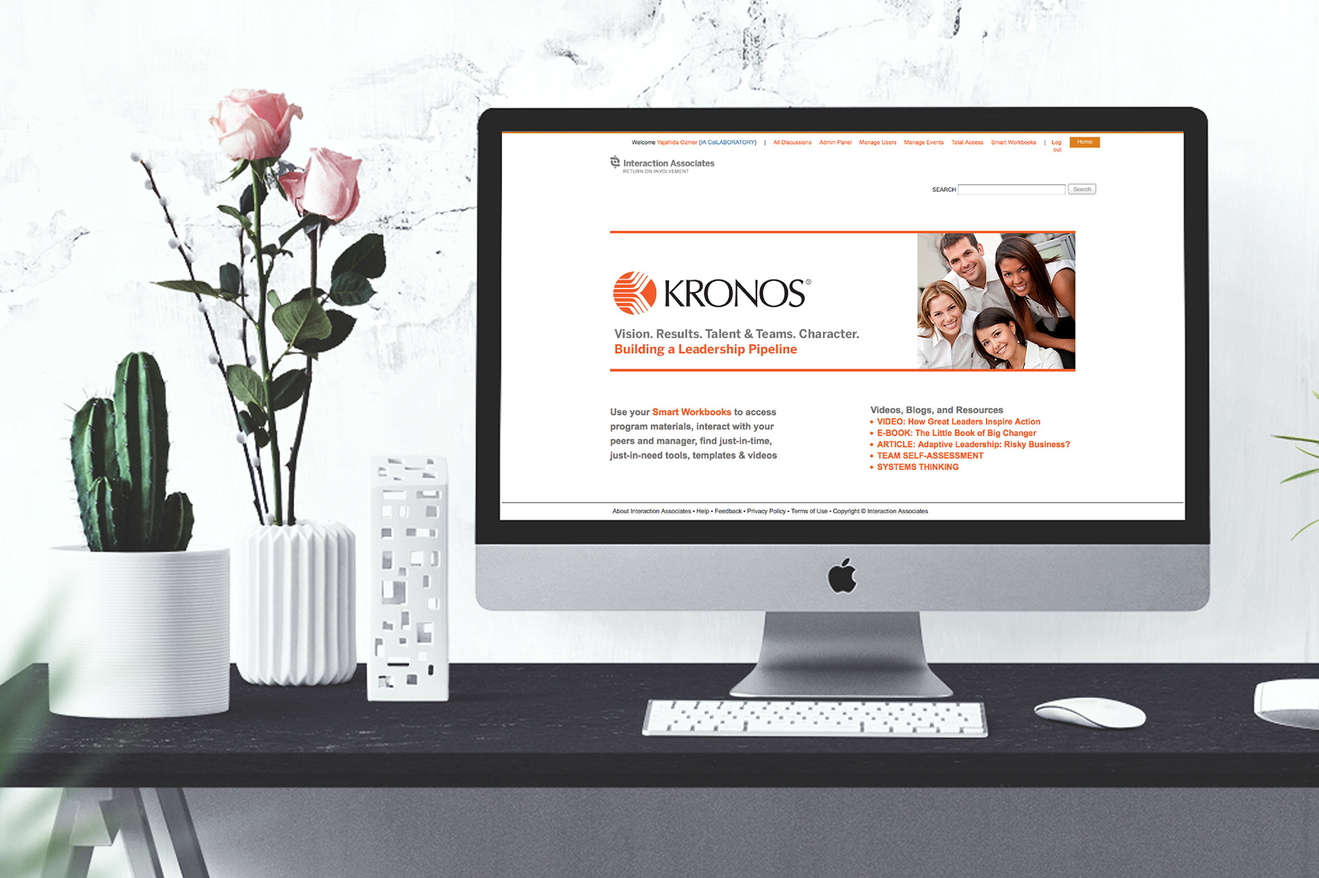
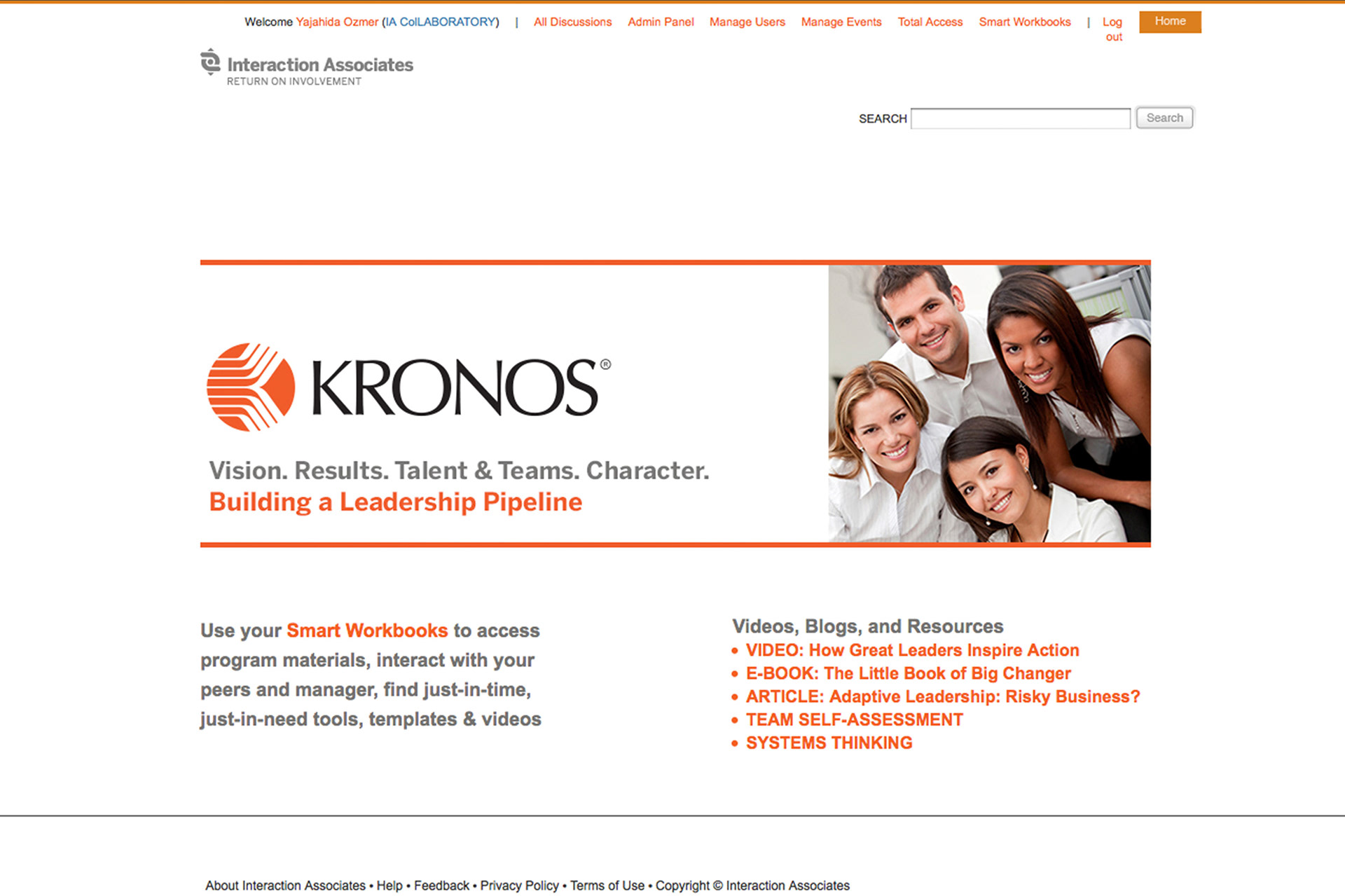
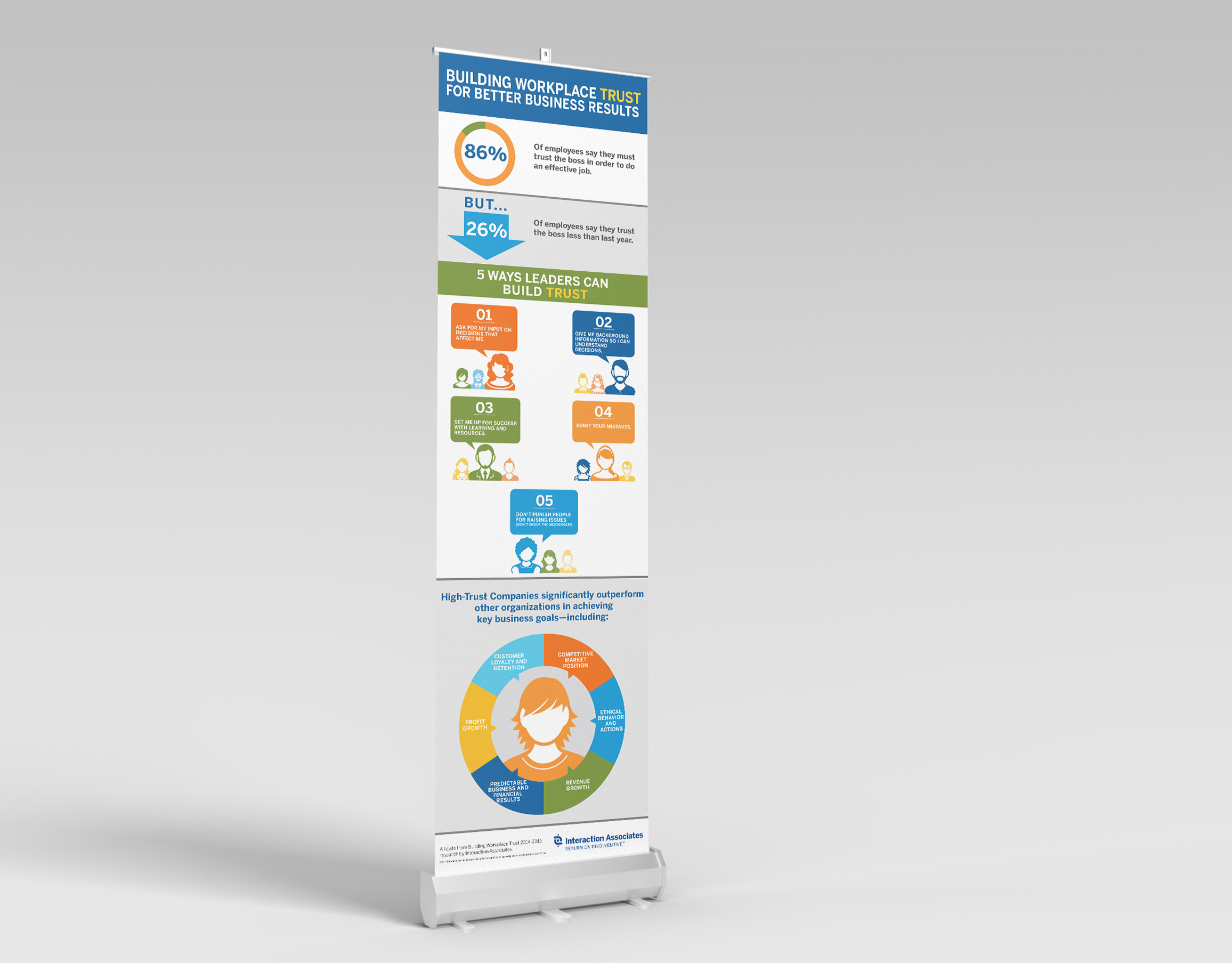
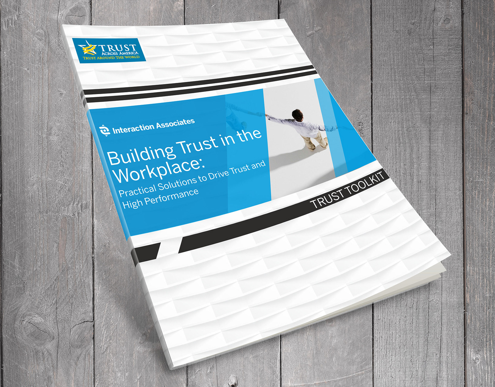
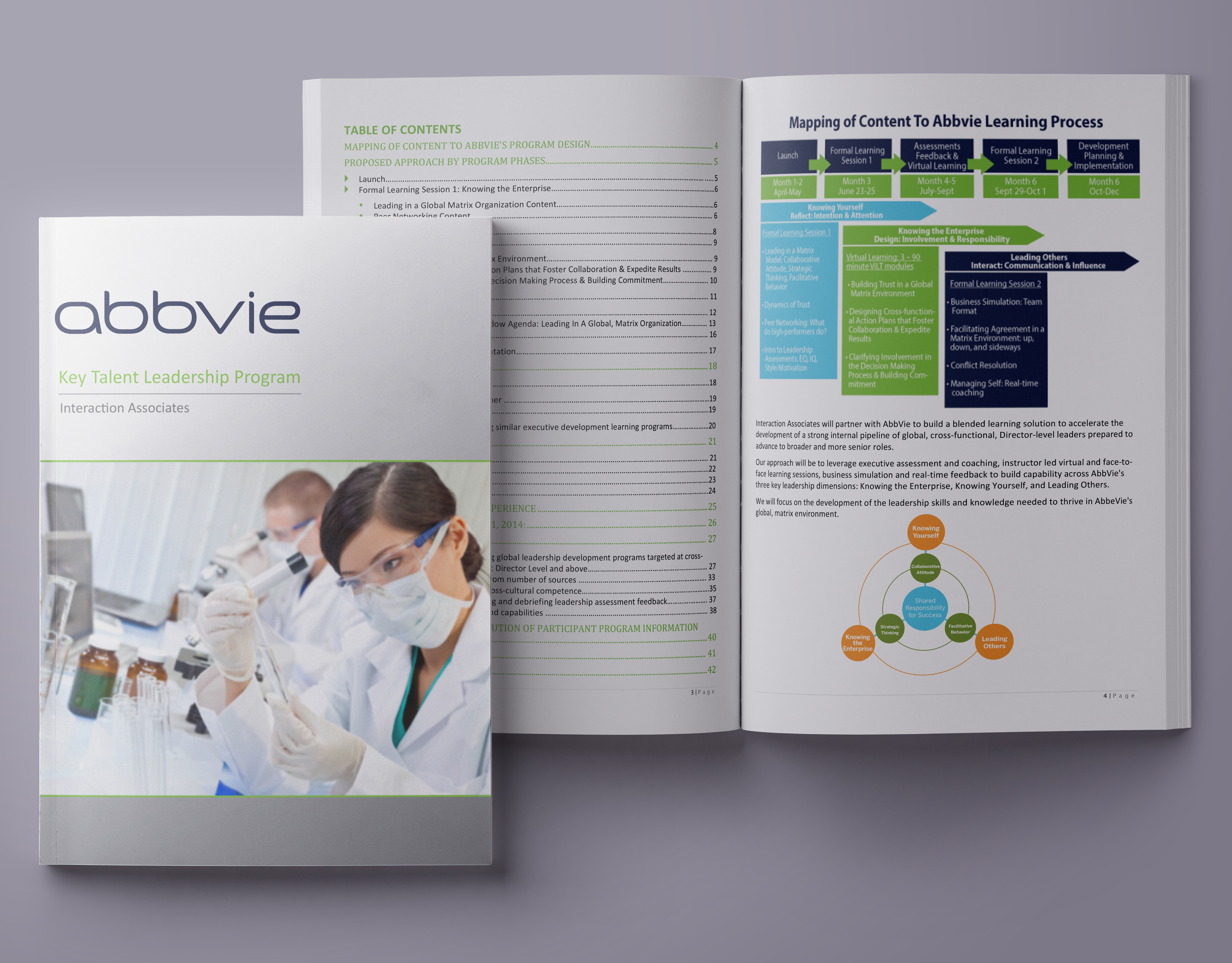
Kronos encountered a challenge prior to introducing the their e-learning portal. The online portal lacked a cohesive and uniform appearance for their workbooks and e-learning tools. This resulted in confusion and a less-than-ideal visual experience for Kronos employees.
Solution:
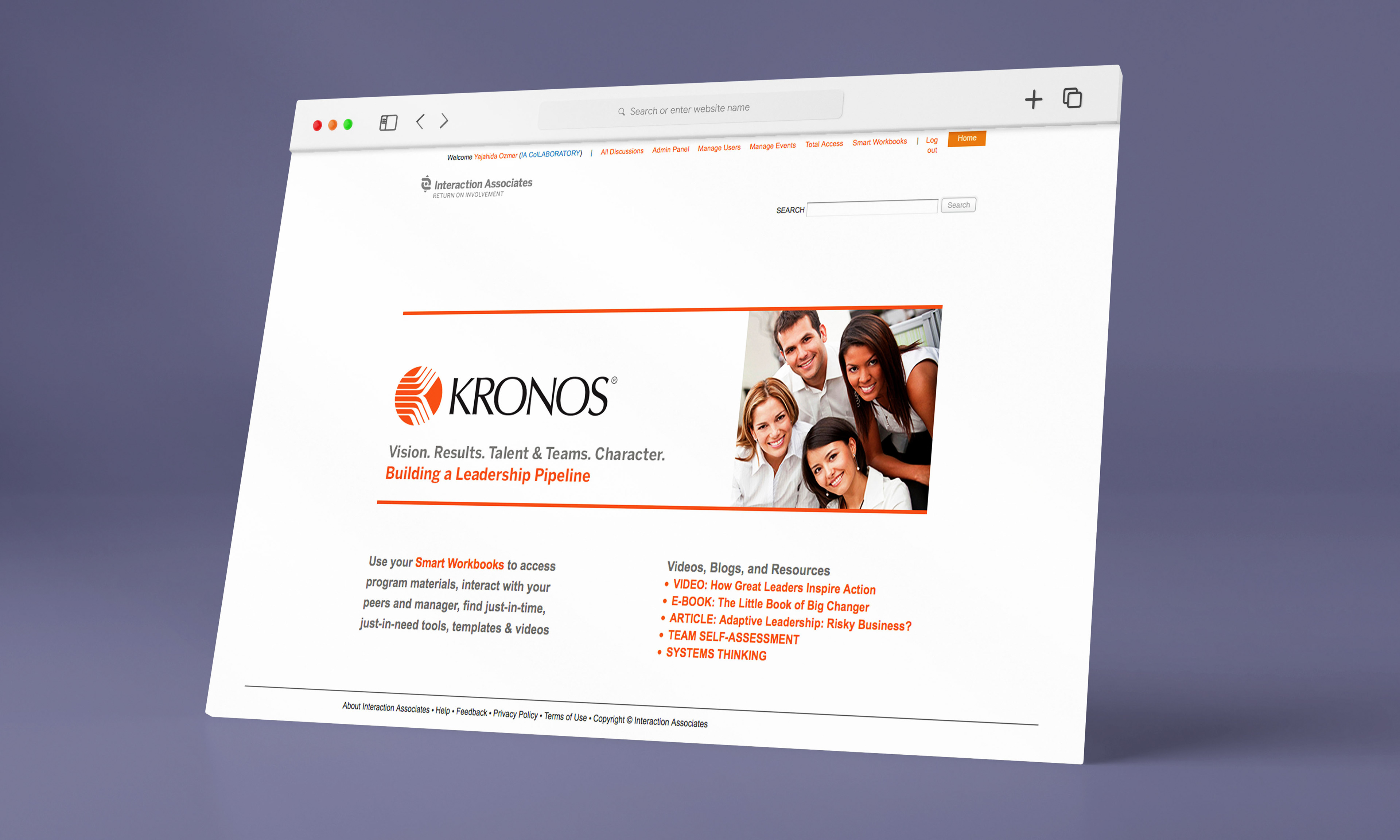
I crafted a sleek portal at Kronos that seamlessly matched the aesthetics of workbooks and e-learning tools. This new design not only improved the overall look but also ensured everything worked together seamlessly. This change not only enhanced Kronos' visual identity but also created a cool and organized learning space, helping employees excel in their professional development.
Software Used:
Dreamweaver, Photoshop, HTML, and CSS
Category:
Portal Web Page and Branding
